
City Connect. Sometimes it’s kinda cool reading about the little details and design choices that went into making them; other times, they range from underwhelming to baffling. But MLB’s never going to stop looking for chances to move merch, so… as of 10am, we have this year’s batch on display, and presumably in stores.
The one major difference this year is that MLB launched all of this year’s uniforms in one announcement. The M.O. in previous seasons is that teams would stagger the launches, usually showing them to the world a few weeks before they were set to debut. This time, they just kinda released them into the wild en masse.
So let’s see what we have to work with, and I’m going to go in rough order of what I think of them. Though admittedly, a few of them rose or dropped a spot or two as I was putting my thoughts together.
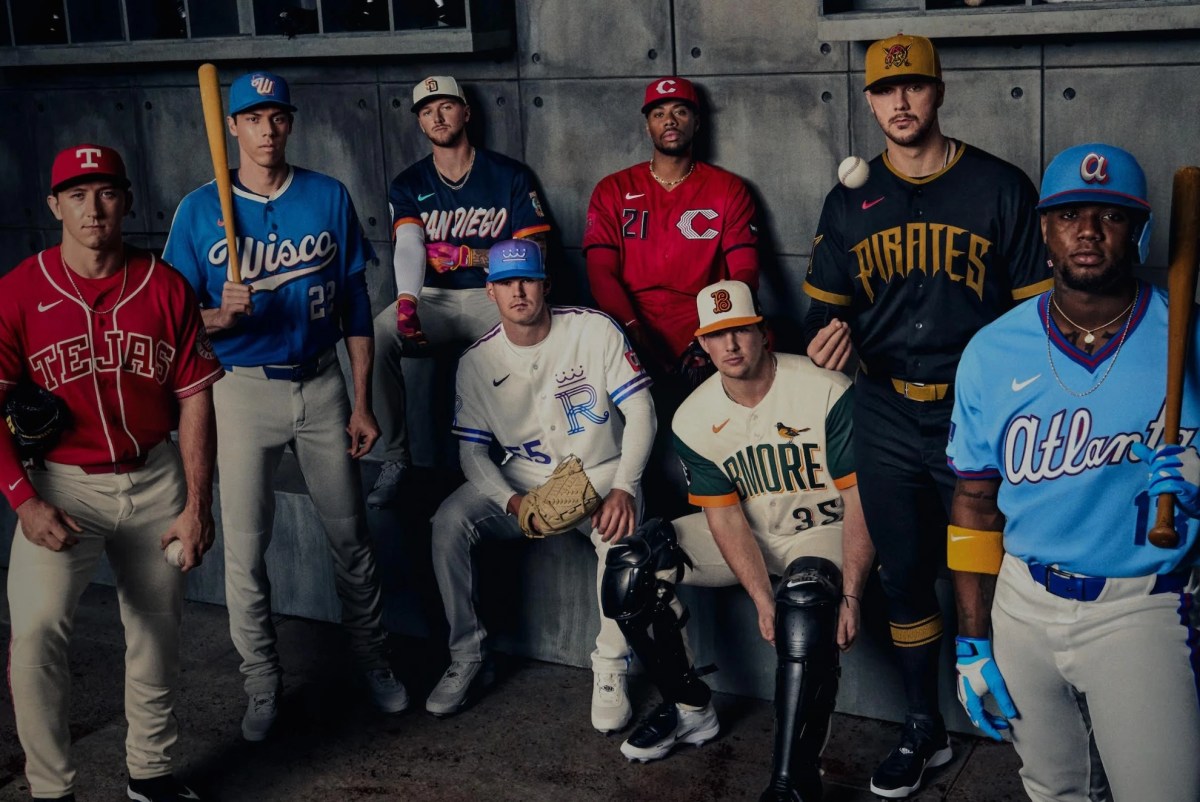
Atlanta Braves
The previous City Connects were kind of an unfinished Etsy version of the 70s throwbacks with “The A” branding, so I was not a fan. For the current unis, I consider myself a Powder Blue Afficionado, so I LOVE the color choice. The Braves’ 70s unis have long been one of my favorite retros, so still borrowing the fonts and stylings of that uni set also appeals to me. “No notes”, as they say.
Pittsburgh Pirates
The previous ones were OK, but they were a little TOO evocative of the Lumber Company black-and-gold, and I was never quite sold on the “PGH” branding. I always thought the jerseys looked better the few times they wore them with the white pants. This one? Same basic problem — I really dig the jersey in isolation, but the full set leaves me a little underwhelmed. Mono-black always feels kinda try-hard to me (and is gonna SUCK in summer), and it doesn’t really go well with a gold hat.
On the other hand, if I was considering a Konnor Griffin jersey, this might be the one.
Baltimore Orioles
I’ve long been a fan of the vest or vest-adjacent look with contrast sleeves, so I kinda dig this. I don’t know if “BMORE” is a thing; I’ll leave that to the locals. Since the previous set was mono-black, I’d say this is an improvement.
San Diego Padres
It’s OK… I just think a) it looks a little like they snuck a peek at the Giants’ paper from last year and b) I thought the previous… I don’t know, “tropical chaos”?… ones were fun and really something distinct.
Cincinnati Reds
There are some things I like. They actually used RED instead of mono-black this time, which… that’s great. And in the closeups, there are red-on-red pinstripes that actually look quite nice. But to some extent, it just feels like an incremental re-color of the previous (black) set, and maybe it’s TOO much red. So they may also have the Pirate problem where the jersey might fare a little better in a different overall set. Like… that jersey with white pants might really rock.
Kansas City Royals
I guess it looks OK, though it also has the Reds’ issue where it looks like an iteration/recolor instead of something new. Change the top from blue to white, put the sleeve logo on the chest, and call it a day. To be fair, I guess there’s some additional striping and they worked some pink in there too, but… ehhh.
Texas Rangers
It’s clean. If you’re a “less is more” person, this might be the second best behind Atlanta. And probably an improvement over the Hot Topic/Ed Hardy Fontapalooza that the previous set was. The problem is that it just looks like a college team. And looking at some of the detail shots, it seems like the best features aren’t going to be things you’re going to see on a TV broadcast. Kinda like the O’s previous ones had that rainbow sleeve treatment — literally the best part of the thing — that was initially on the INSIDE of the cuff.
Milwaukee Brewers
Just kinda boring and underwhelming in a way I can’t quite put my finger on. Feels like something AI came up with. And again, is “Wisco” a thing, or is it something marketing came up with?
